I built this pipeline to explore Google Cloud Platform’s data ecosystem while analyzing NYC taxi data. Using trip records from yellow and green cabs, the project demonstrates how modern cloud tools can transform raw transportation data into actionable insights about urban mobility patterns.
The Dataset and Challenge
The NYC Taxi and Limousine Commission publishes detailed trip data - pickup/dropoff locations, times, distances, fares, and payment types. It’s perfect for understanding urban transportation patterns, but the volume makes traditional analysis tools struggle.
The challenge was building a pipeline that could process this data efficiently while staying maintainable and cost-effective. I wanted to answer questions like: How do trip patterns change during rush hours? Which zones generate the most revenue? How do weather events impact taxi demand?
Building with Modern Tools
I chose Mage as the orchestration tool after evaluating Airflow and Prefect. Mage’s visual pipeline builder and built-in data quality checks made development significantly faster. Plus, I wanted to contribute back to their open-source project, which I did by improving their BigQuery connector documentation.
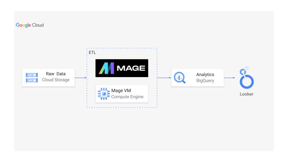
The architecture follows a classic medallion pattern. Raw CSV files land in Google Cloud Storage, Mage orchestrates the transformation pipeline running on Compute Engine, cleaned data flows into BigQuery, and Looker Studio provides the visualization layer. Each component was chosen for specific strengths - GCS for cheap blob storage, BigQuery for scalable analytics, Looker for self-service dashboards.
Technical Implementation
The ETL pipeline handles several complex transformations. Parsing NYC’s location IDs required joining with their official zone lookup tables. Calculating trip durations revealed data quality issues - some trips showed negative times due to system errors. I implemented data quality checks that flag anomalies while preserving valid edge cases.
BigQuery’s partitioning by date and clustering by pickup location reduced query costs significantly. A query scanning the full dataset would cost dollars; with proper partitioning, it’s pennies. This optimization was crucial for making the dashboards responsive and affordable.
The Looker Studio dashboards update automatically as new data arrives. Users can filter by date ranges, zones, or payment types to understand trends. One interesting insight: credit card payments have steadily increased, but cash still dominates in certain neighborhoods, revealing digital divide patterns across the city.
Lessons from Cloud Migration
This project taught me practical lessons about cloud architectures. BigQuery’s serverless model removes infrastructure headaches but requires thinking differently about cost optimization. Instead of provisioning servers, you optimize queries and data organization.
I also learned the importance of incremental processing. Initial runs processed all historical data, but daily updates only process new records. This pattern, implemented through Mage’s incremental models, keeps costs linear as data grows.
Real-World Applications
While this uses taxi data, the patterns apply broadly. The same architecture could analyze e-commerce transactions, IoT sensor readings, or application logs. The key is choosing the right tool for each job - orchestration for workflows, columnar stores for analytics, visualization tools for insights.
Contributing to Mage’s open-source project was rewarding. My documentation improvements help others avoid the BigQuery authentication issues I struggled with. Open source isn’t just about taking; it’s about improving tools for everyone.
This pipeline serves as a reference implementation for organizations migrating analytics workloads to GCP. It demonstrates that cloud-native doesn’t mean complex - sometimes the simplest architecture is the most powerful.
Full implementation and cost analysis available on GitHub.